International Relations scholars often talk about the "diffusion" of norms, behaviors, security worries, etc. throughout the international system. Foreign aid policy is one such norm -- one that developed, democratic countries often are peer-pressured into sharing. But which countries lead the way in terms of aid commitments?
Aside from being a visually appealing representation of a network of relationships, network analysis of the international system helps to bring to light (and also account for) the fact that international politics is inherently multilateral. Most analyses in international relations (even many of my own) treat international politics as though it were a bilateral affair, taking place between isolated dyads. Such an approach ignores the obvious fact that country X's relationship with Y is doubtlessly impacted by Z.
This is not to say that analyses that treat dyads as their primary unit of analysis should be thrown in the trash heap -- the dyadic study still has its place. To the contrary, in addition to dyadic analyses, methods such as network analysis could to be applied in an effort to unearth more dimensions of complexity inherent to international relations.

Why Network Analysis?
The study of networks in the social sciences has largely been restricted to sociology; however, more recently, other fields such as political science (international relations in particular) have adopted network science as a tool in the study of social phenomena. Networks provide a visually intuitive graphical representation of the multiple connections among numerous actors.Aside from being a visually appealing representation of a network of relationships, network analysis of the international system helps to bring to light (and also account for) the fact that international politics is inherently multilateral. Most analyses in international relations (even many of my own) treat international politics as though it were a bilateral affair, taking place between isolated dyads. Such an approach ignores the obvious fact that country X's relationship with Y is doubtlessly impacted by Z.
This is not to say that analyses that treat dyads as their primary unit of analysis should be thrown in the trash heap -- the dyadic study still has its place. To the contrary, in addition to dyadic analyses, methods such as network analysis could to be applied in an effort to unearth more dimensions of complexity inherent to international relations.
A Network of Foreign Aid Commitments
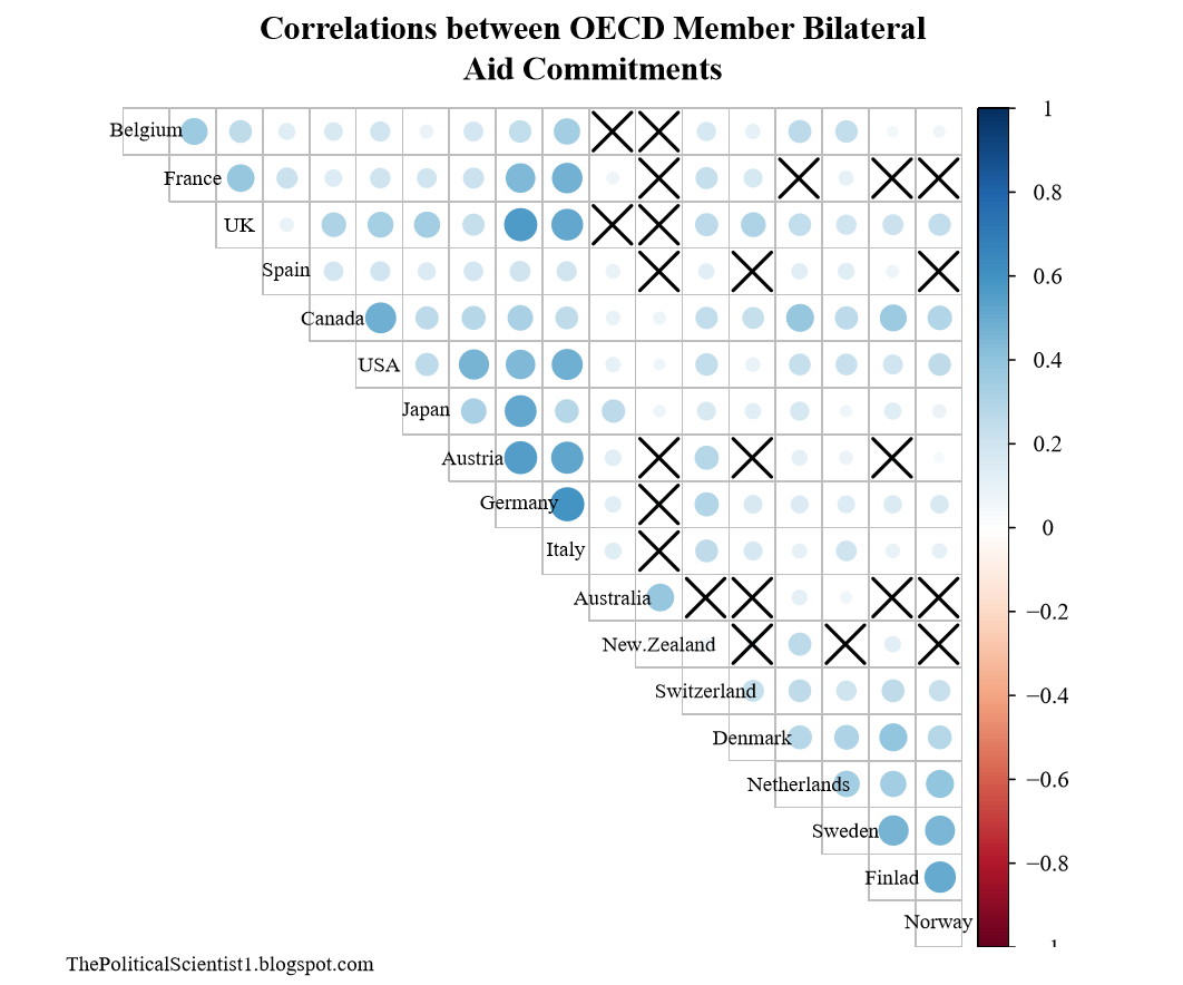
The value of network analysis is readily apparent when one compares the below figures. The first is a correlation plot that shows the strength of correlation between 18 Organization for Economic Co-operation and Development (OECD) member countries' bilateral aid commitments (data is from 1993 to 2011) to non-member states (larger circles reflect a stronger correlation and Xs mean that the correlation failed to reach statistical significance).
The second is a network of correlations where the strength of the correlation between nodes' (donor countries) bilateral aid commitments is reflected in the width and transparency of the edges (lines connecting nodes). Correlations less than the mean value (r = 0.2042) were excluded from the network.
Not only is the network far easier to interpret, it readily reveals the extent to which there is notable clustering in the strength of correlation between donors' bilateral aid commitments. Germany, France, the U.S., the U.K., Italy, Austria, Canada, and Japan form one distinguishable cluster, while the Nordic countries (Norway, Sweden, Finland, the Netherlands, and Demark) form another. New Zealand and Australia are far to the side and form a loosely connected bilateral cluster, meanwhile other countries, like Spain and Switzerland show correlations with numerous other countries; though these correlations are not particularly strong.
The Value of Network Analysis
While an important limitation inherent to univariate correlations is the lack of control variables, placing pairwise correlations within the context of a network brings some context to an otherwise limited statistical method. This is the strength of network analysis and ample reason to include network science in one's toolkit of data analytic and visualization methods.
To obtain the data and R code for this post, see my GitHub repository for this analysis.
Comments
Post a Comment