Is the House Member from My District Voting in Accordance with My Ideology? Is S/He a Leader or a Follower?
With election time coming up soon (Nov. 8th!), and with the headlines obsessed with the presidential race, I wanted to take a moment to focus on down ballot races--in particular, congressional district races for the House of Representatives.
I have zero interest in telling anyone how to vote, but I would like to help any interested parties figure out where the incumbent in their district stands in terms of ideology and overall congressional leadership relative to other House members. Knowing this information might, at the very least, help a given voter to know whether the incumbent in their district is performing they way they want them to perform.
I'm also going to use this as an opportunity to demonstrate how to use R (a great tool for doing an analysis like this) to determine where the incumbent in your congressional district stands relative to other House members. If you follow the steps outlined below (and if you download R and R Studio, which is free by the way), you should be able to make a nice scatter plot like this one:

In the above example I highlight Rep. Dold, the Republican incumbent from Illinois' 10th Congressional District, in order to compare him with other House members. It seems pretty clear that Dold is not only a moderate/centrist Republican (one that has also not endorsed Republican presidential nominee Donald Trump, by the way), he also, based on his legislative activity is more of a leader compared to other House members (leadership is based on cosponsorship of bills--more cosponsors on the bills you write = more leadership).
The code I used to upload the data and then make the above scatter plot is shown below along with instructions. You can click on the image to enlarge it if it's hard to read.

If you have any questions, run into any problems, or simply don't care to do any of the work yourself, just leave a comment below and I'll do my best to respond in a timely fashion.
Happy coding, and make sure you vote!
**********
Update: I made an interactive graph, too!
---------------------------------------------------------------------------------------
*The fine people at GovTrack have a great plot like the one above, along with an interactive one; however, they only provide code for Python users rather than R users.
I have zero interest in telling anyone how to vote, but I would like to help any interested parties figure out where the incumbent in their district stands in terms of ideology and overall congressional leadership relative to other House members. Knowing this information might, at the very least, help a given voter to know whether the incumbent in their district is performing they way they want them to perform.
I'm also going to use this as an opportunity to demonstrate how to use R (a great tool for doing an analysis like this) to determine where the incumbent in your congressional district stands relative to other House members. If you follow the steps outlined below (and if you download R and R Studio, which is free by the way), you should be able to make a nice scatter plot like this one:

In the above example I highlight Rep. Dold, the Republican incumbent from Illinois' 10th Congressional District, in order to compare him with other House members. It seems pretty clear that Dold is not only a moderate/centrist Republican (one that has also not endorsed Republican presidential nominee Donald Trump, by the way), he also, based on his legislative activity is more of a leader compared to other House members (leadership is based on cosponsorship of bills--more cosponsors on the bills you write = more leadership).
How to Do It
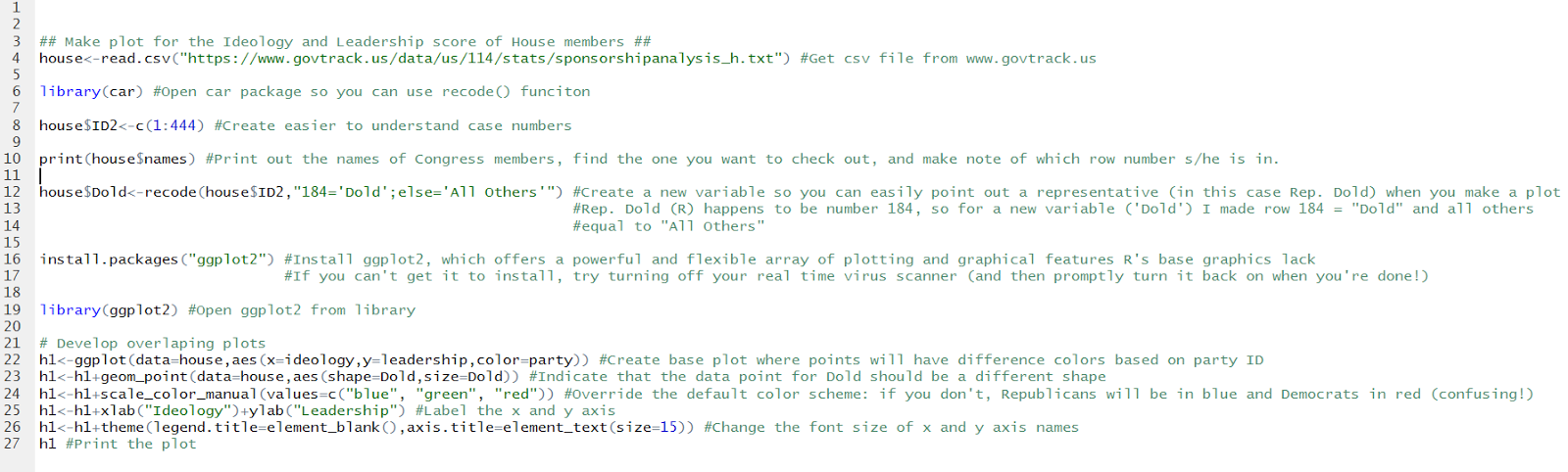
The great thing about living in an online world is that if you want to ask a given question that requires data in order to answer it, you can easily find a reputable source of that data with very little effort. For our purposes I'm using the data on House members' ideology and leadership scores provided by www.govtrack.us.*The code I used to upload the data and then make the above scatter plot is shown below along with instructions. You can click on the image to enlarge it if it's hard to read.
If you have any questions, run into any problems, or simply don't care to do any of the work yourself, just leave a comment below and I'll do my best to respond in a timely fashion.
Happy coding, and make sure you vote!
**********
Update: I made an interactive graph, too!
---------------------------------------------------------------------------------------
*The fine people at GovTrack have a great plot like the one above, along with an interactive one; however, they only provide code for Python users rather than R users.
Comments
Post a Comment